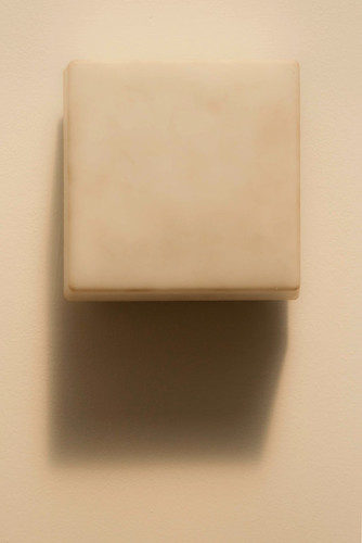
With warm tone. That's the way it came out of the camera. Sunny sky filtered through frosted skylight onto an indoor lighting fixture at the Fort Lee historic site, visitor's center. No artificial light was on at the time. A radical shift from the high contrast saturated colors I posted the last couple of days.
Gear: Today I grabbed my 28-105 lens. I used this one all the time with my film camera, a Canon Elan II that I bought when my kids were born about 13 years ago and I wanted to get back into taking pictures with a "real" camera (my only other SLR had been the Canon AT-1 that I got in high school ca. 1979, and it didn't work any more). The lens has a solid reputation as one of the better consumer-level zoom lenses, and a USM focusing motor that is virtually silent. I also loved the Elan, it had a good solid design that I wish I had in the digital Rebel. The Elan was a step up from the original Rebel line for film, but not very expensive, roughly analogous to the D60 today, but that's close to $1000.00 with tax, I paid about half that for the Rebel XTi when the price dropped with the release of the XSi a few years ago).
Anyway, 28-105 is a nice walking around lens for a film camera, but a little awkward for a digital camera where it translates to a 45-170 (ish) lens. Not only that, I found the colors of the lens on digital to be a little unusual, a bit soft, not quite sure exactly how to describe it. Maybe I just got used to the sharp saturated colors of the kit lens that I bought for the Rebel. Either way, I put it away and have seldom used it with my digital camera, but today I decided to play with it a bit and see if I can learn to love the colors and the softer quality overall of this lens. You can see a little of that softness in the image above, where it's a good thing, I think.
And 45-170 isn't that bad for a range, 45 seems like wide when you've been shooting a lot with an 80mm equivalent (the 50mm 1.8 prime).
I like the dreamy look to this image ... it pulls me into the shot even though I have no idea what it is. Its good to change up your shooting style every now and then, makes you think. You have a wonderful eye for details I like that.
ReplyDeleteThis is really nice. Simple and abstract at the same time. I like the idea of playing with whites. Just soft tones. It just goes to show how complicated 'white' can be. Add some natural light, some texture, shadow, slight colour tones, and you have a wonderful artistic image.
ReplyDeleteYou keep giving me ideas for things to try :)
Nice abstract, Mike. The soft tones work well. Love your eye for detail!
ReplyDeleteFYI... regarding your comment about blogger and losing comments on Gerry's blog. I get around this by opening the blog in a second tab so I can click on the image and flip back and forth between comments and image. Hope this helps on future comment attempts :)
Thanks guys! This is actually one of my personal favorite shots of the summer, as simple as it is. It's inspired, in a way, by this:
ReplyDeletehttp://www.moma.org/collection/object.php?object_id=80385
And thanks for the tip, Cheryl - I need to make that a habit...
ReplyDelete