Friday, September 30, 2011
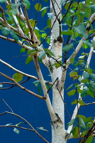
Birch in Blue
At a construction site in midtown. A plywood protective barrier painted blue sets off the white bark of the birch tree. Taken yesterday, I can relax for today :-)
Thursday, September 29, 2011
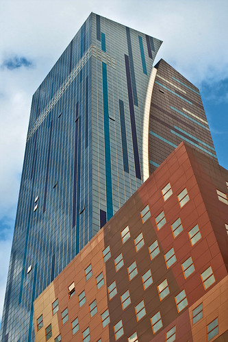
Post Modern
The Westin Hotel on 42nd Street. I was standing on the corner waiting for the light to change and thought, what the heck. I suspect there are around a million shots like this on flickr, but I wanted to post something completely different today.
Wednesday, September 28, 2011
Tuesday, September 27, 2011
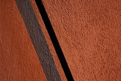
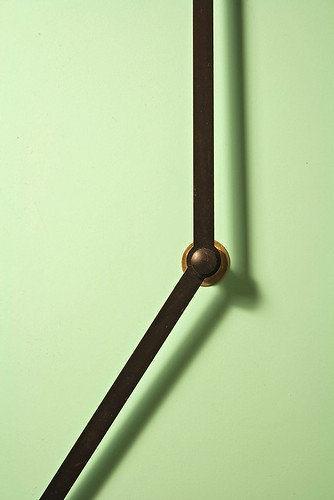
Fire Alarm
Took some Photography Club students on a photo walk around the school today. This is one of my shots, indoors, with shiny glossy paint.
Monday, September 26, 2011
Sunday, September 25, 2011
Assignment: Simplicity
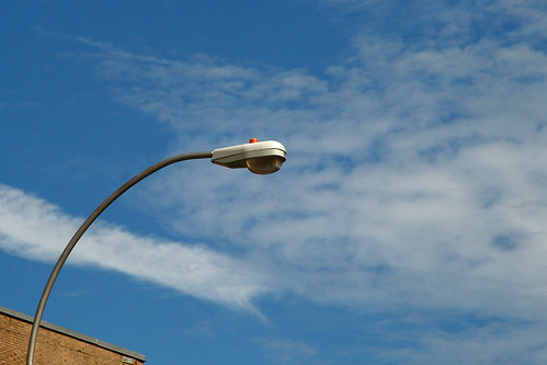
For the first shot on this assignment I'm going with the obvious, it's the only one I took today that seems presentable and fulfills the requirements of the task.Obvious because in the city this is one of the easiest subjects for such an assignment, a street light or utility pole or a flower juxtaposed against a blue sky, with or without clouds.
The idea behind simplicity is to include a (usually) single subject within an otherwise vast expanse of negative space. There may be a little too much going on with the clouds here, though. I guess there are degrees of simplicity.
Saturday, September 24, 2011
Acorn on Metal Plate
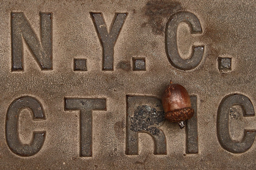
Another sign that Fall is here. I missed posting yesterday, so today is a two-fer. I'm done with "texture" as an assignment. I get it. I may post a few more that I took today, but only if I get stuck later in the week and can't get out to shoot. This shot isn't just about texture, but the texture adds to it. I found the acorn in this position. I don't know why, but that's an issue for me - I want to shoot the world mostly as I find it, not rearrange things to make it look a certain way. Not that I would never take liberties...
The recent assignments have definitely helped me. A lot of times I see something I think is beautiful and I want to photograph it, but I'm not really sure what it is that I find appealing, Spending a week or more working exclusively on color or texture has helped me think more about that question and compose the shot with a conscious awareness of what visual element I want to accentuate.
I also see that I am naturally drawn to the little details of the world. I find it easier to see and compose a photograph that captures beauty in the details, and a challenge to step back and take pictures of the larger world. That may well be an assignment for another day...
Leaf & Ragtop
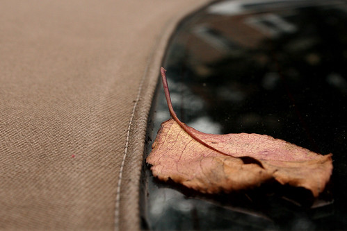
This is supposed to be about the texture of the ragtop, but I think the leaf takes center stage. I had other ideas but it's been overcast and difficult to get the kind of textures I want.
Thursday, September 22, 2011
Tomato
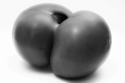
I took this over the summer, no time today to shoot anything new, and thought this fit in with the assignment of texture. Yesterday was metallic smooth & shiny, today organic smooth & shiny.
Definitely inspired by Weston's Green Peppers
Wednesday, September 21, 2011
Tuesday, September 20, 2011
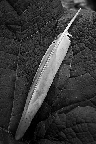
Leathery & Feathery
I know this looks contrived, but this is exactly as I found it - minus the color, of course. Didn't move or rearrange a thing. Taken Sunday, I didn't have time to get anything new today.
Monday, September 19, 2011
Welded Steel
So this is one of those completely abstract textured surfaces. but at least there are two contrasting textures here. It's a close-up section of a roughly human-sized sculpture along the Hudson river made up of (apparently) these little bits of stainless steel welded together into something indescribable - I should take a picture of the piece from a distance or maybe just link to someone else's image. It points North. It's also possible the welding in some parts is just laid on top of a solid sheet of stainless steel.
UPDATE
9/21/2011 Replaced original photo with this version.
Sunday, September 18, 2011
Assignment: Texture
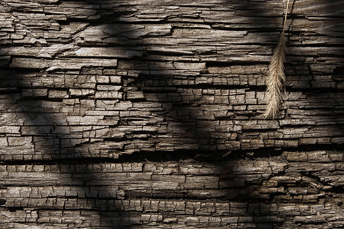 |
| Crackled Wood |
Like the color assignment, where the idea was not to shoot things that have color, but to shoot the color of things, this week I will be shooting the textures of things. A subtle but important distinction. Unlike color, where I was limited by the omission of black, white, gray, & beige as colors and looking for big bold colors, here any texture goes. I can't complain that my neighborhood doesn't have a lot of texture!
Like everything else, it's harder than it looks. It gets a little boring if everything is completely abstract, so including something for context/contrast/scale is often helpful, I think. The dried up grass seed head was in the original scene when I found it but I did have to move it out of the shadows.
Saturday, September 17, 2011
Assignment: 20 Shots
Sounds like a drinking game, a foolish one for sure. But the idea is to pick a relatively mundane object, like a fire hydrant, a dumpster, a car, a kitchen sink - and take 20 pictures, to really get to know the object and, the way I see it, to practice patience and staying with it.
I did have to overcome the feeling like a fool part of it as people walked by, but I did it. I am posting some of the pictures that I think came out pretty good, plus the first one below just for context. The last one is familiar, but I dialed down the depth of field as much as possible to make it more interesting, I hope. Three of the shots in fact were taken at 1.8, I think.
The last one is in black and white only because there were a couple of annoying drips of red & green paint that were just too distracting.
This first one is also in black & white because of the single splash of green being a nuisance in the planter.
Update: I added another one that I missed before.
 |
| For context |
 |
| The entire block of hydrants is missing caps. |
 |
| Corroded Base |
 |
| Almost forgot this one... |
 |
| Shallow depth of field, cap |
 |
| Black & white birds-eye view |
The sun was in and out as I took the pictures, which partially explains the inconsistency in color tone. I could have converted them all to b&w, I suppose, but I like the rust color mixed in with the black paint.
Friday, September 16, 2011
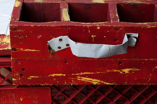
Flavor Compartments
I don't know what else to call them. This is a makeshift Dominican shaved ice pushcart. A homemade wooden box divided into compartments holds the different flavored syrups that are added to the ice. Mounted on top of a grocery store shopping cart. A common sight in the neighborhood, especially around schools at the end of the day.
Thursday, September 15, 2011
Garlic & Pepper
Shakers at the take-out window of a pizza joint on Audobon Avenue, forgot the name. Used to get lunch here occasionally when I worked at a nearby school, IS 143.
Wednesday, September 14, 2011
Fire Escape 3
This one is pushing the definition of "color." Black, white, gray, & beige do not count as colors for the purpose of the assignment, but the black has a bluish quality and the fire escape is a little beyond beige, so I'm going with it.
Tuesday, September 13, 2011
Shattered
Shattered mirror reflecting traffic sign and blue sky. I wish I had used a smaller aperture to get both the sign and the mirror surface in sharper focus, but that's one of those technical details I neglected to consider in this shot.
Monday, September 12, 2011
Sunday, September 11, 2011
Orange Seat on Green Pavement
The most recent and the next few pics I will post are studies in color. They are exercises designed to make the eye/mind aware of color in the world and to experience that flash of perception that recognizes the aesthetic quality of these colorful things. Then transfer that perception into photographic form, which is to a large extent a process of subtraction.
Our field of vision is like a very wide-angle lens, (without the distortion) in terms of peripheral vision and what we are capable of "seeing," but our mind is constantly reducing that field to a much smaller area that we focus on. In other words, when we see a beautiful or interesting scene, the mind edits out the extraneous information. But a camera by itself cannot do that. This is why the casual shooter is so frequently disappointed that the pictures don't depict the experience, and why the successful photo depends on, usually consciously, subtracting the peripheral from the central in framing an image.
In the book I am reading, this is called "forming the equivalent." It's where vision and technique meet. I know in a lot of shots I look at after going out shooting, the technical stuff is great, the vision needs work. In other shots the vision is fine, but the technique needs work - the exposure is wrong, the depth of field is too shallow or too deep, the shutter speed too slow, those kinds of things. I'm still struggling to integrate all these variables.
Practice may not make perfect, but it makes better...
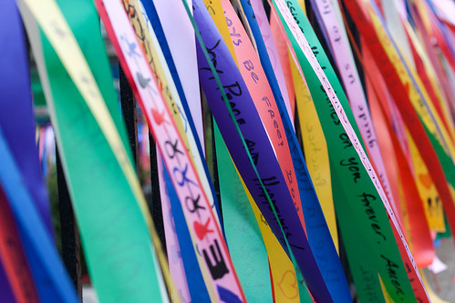
Love, Peace, Remembrance
Ribbons decorating the perimeter of The Fort Washington Collegiate Church in my neighborhood. I respect anyone who promotes tolerance, understanding, and bringing people together.
Update: This post was slightly edited for personal reasons.
Saturday, September 10, 2011
Subway Station Door
A blue theme today. Not my intention, but just happened that the only shots I liked in terms of technical aspects - composition, lighting, focus, etc., had dominant blue colors.
Blue Brick Wall
Continuing my hunt for the wild color opportunity, I ventured into a different neighborhood with a somewhat less muted color palette.
I missed altogether yesterday, although I did take a few shots. I went out a little too late in the day and there just wasn't enough light. I think it's the first day I've missed posting something since I started. I'll post a second shot today to make up for it. I expect to stockpile a lot of stuff on the weekends from here on out that I can post during the week if times are tough.
I did look through my old folders to see if there was anything I had shot in the past that would fit the assignment to shoot color, and was a little surprised that I had absolutely nothing, except for a couple of shots from the summer that I already posted. Which tells me the value of this exercise in opening my mind to the possibilities. All summer I've gone out to just shoot whatever strikes my fancy and missed a lot of things for lack of openness.
It's been said that all children are artists, and most of us learn how not to think like artists as we grow up. The fortunate ones are able to hold on to that child-like perception of the world while still being able to function in the day-to-day practical world. I have to learn the hard way how to recapture that ability.
Thursday, September 8, 2011
Wednesday, September 7, 2011
Assignment: Color
The goal (I'm reading "The Practice of Contemplative Photography") was simply to photograph color. Preferably bold, strong colors, but my neighborhood tends more toward muted colors, earthtones, etc. So this is about as bold as I could find this afternoon. In a way the pattern of bricks is competing a bit with the color, but I don't know if it's distracting or balancing.
I'm finding the book useful if at times a bit wordy and "Zen" - but the idea is to be in the moment, to perceive the world as it is rather than through the filter of "conception" where we see things more in terms of their functions and other learned connotations and associations. So in the picture above, I noticed (because I was looking for it) the color first - there was a moment where I perceived the beauty of the scene before my conscious mind had time to assign names to the various parts of the scene, then the goal was to capture that beauty so that the viewer will also be struck first by the color - it should be immediately obvious that this is not a picture of a "brick wall" or a "wooden panel" or some "plumbing works" (or gas or whatever), but simply about the inherent beauty of the color.
Tuesday, September 6, 2011
Sidewalk Hydrant
Back to work day and a rainy day, so this is another shot from yesterday's walk. I was attracted to the combination of sidewalk graffiti (MAGGI -N- JOSH) & fire hydrant.
Monday, September 5, 2011
Sunday, September 4, 2011
Color Dilemma
I can't seem to make up my mind on the color vs B&W choice. It used to be much easier. In the old days, if you wanted black & white, you put a roll of Tri-X (or whatever) in the camera and shot B&W. If you wanted color, you chose a color film. It was possible to get B&W prints from color negatives, but the results weren't necessarily pleasing. Forget about color from B&W film.
Now of course, the camera shoots in color, all the time, and you make a choice in processing. Sometimes the choice is easy, sometimes not. Is it really just a matter of taste, or are there some general guidelines that dictate when to use one or the other? In the previous post, I submitted two pics in color, but the more I play around with it, the more I like B&W. I've had the opposite experience, where I posted something in B&W and later changed my mind and reposted in color. Here I can't make up my mind, so I'm posting both. Help!
Update
I did a little searching around on the topic. Here's a photographer who posts side-by-side color/b&w versions and asks viewers to vote:
Ferran Jordà Photography Photoblog
And here is Eric Kim, a street photographer, with his general guidelines and examples. I didn't always choose what he chose in the pictures posted.
Black and White or Color in Street Photography: How Do You Make the Decision?
Saturday, September 3, 2011
Signs On The Back Of A Sign
On the foot bridge over the Henry Hudson Highway, the back of the bike path sign.
Friday, September 2, 2011
Garden Fairy
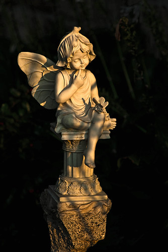
Continuing with the golden sunlight and high contrast theme, another garden sculpture from a little-traveled section of Riverside Drive in the shadow of the George Washington Bridge for most of the day, until late afternoon..
Thursday, September 1, 2011
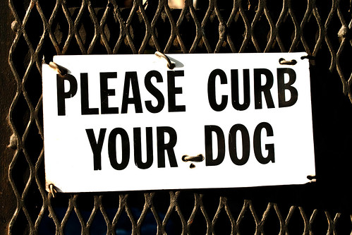
Please Curb Your Dog
One of the major hazards of walking around the streets of New York with a camera looking for things to photograph, especially in my neighborhood, is that you aren't paying attention to the ground beneath your feet. Last week I stepped in it, and boy was I pissed.
I really don't understand the kind of anti-social behavior that leads people to take their dogs out, watch the dog do its business in the middle of the sidewalk, then quietly walk away knowing that some little kid or little old lady is likely to step in it. Or anybody, for that matter.
And what exactly does it mean to "curb your dog?" I had to look it up. It definitely does not mean that you can allow your dog to poop as long as it's on or near the curb. It apparently comes from a more archaic meaning of the word, which is to control or to constrain. So it really means control your dog and do NOT allow it to poop on the streets, or clean up after it if it does, at least in NYC, which has a "pooper scooper law" passed in the late 1970s - apparently with much outraged opposition!
Unfortunately the law is difficult to enforce, and depends a lot on the good will of the people - good luck with that around here. Although most dog owners are in fact responsible, good-willed human beings, a small percentage in such a densely populated area adds up to a lot of stuff to look out for.
Update: 9/2/2011
I just finished reading the entirety of the articles linked above on pooper scooper laws , and boy the author is a real jerk. It's a Q&A series by a dog lover with a persecution complex. He has no answer for anyone who wants to know what can be done about all the crap on the streets of their neighborhood, other than just deal with it, get over it, stop hating dogs. And if you "don't like" dogs, maybe you should go live somewhere else. The Times paid this guy?
I love dogs, the dog owners sometimes not so much...
Update II: 9/2/2011
Happened again this evening... grrr
Subscribe to:
Posts (Atom)
