Tuesday, August 27, 2013

Bus Terminal


Another frequent subject of mine, the George Washington Bridge Bus Terminal. I just like the clean sky and warm evening sun at the right position to open up the shadows a bit under the overhang. From Saturday.

Back to school this week, so posting will become sporadic again. I hope to avoid going completely offline this time around.

Sunday, August 25, 2013

Thursday, August 22, 2013

International Street Photographers Day


It's not what I do, but for the occasion I bit the bullet. To borrow from Charles Darwin, I felt like I was committing murder. OK, a little over the top maybe - more like theft.

Wednesday, August 21, 2013

Niagara 2008


I was looking for something else in response to s.c.'s post today, but I couldn't find anything publishable. I did find this from our 2008 trip to Niagara Falls, a shot I didn't think much of at the time but now I kinda like it - not really sharp, taken from a boat, but I sharpened as much as I could, hopefully not overly so.

Monday, August 19, 2013

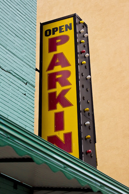
Signs


It's been a while since I posted any signs, and here it was really just an excuse to get in the color of that painted brick.

Thursday, August 15, 2013

Framing the Flag


I'm really not the flag-waving type, and frankly I'd be just as happy if a city like New York would display flags from around the world from the million or so flag poles erected in about every park and multiple buildings, including schools, hospitals, fire and police stations, post offices, libraries, etc. I do like a dash of color against the otherwise clear blue sky and here I liked the framing by the oak branches at this tiny abandoned fort (?) in northern Central Park - with no signs or plaques to explain its significance

Wednesday, August 14, 2013

No Title


If I knew what to call this thing - it appears to be a strictly ornamental extension of a building downtown in Battery Park area. I didn't take a picture of the larger structure.

Tuesday, August 13, 2013

Parkscape


I was thinking today about how I generally suck at landscapes, but I took this anyway because of the quality of the light in that opening where the bench is situated - I hope the effect comes through on your monitor, for me it depends on the angle at which I am viewing it - I need a better monitor!

We're having an unusually mild August in NY, a little below average but I think the last few years have been above average, so it feels a bit weird (in 2012 it was 87 F on this day, on 2011 it was 85, and today was 78, with the average at 84). A couple of nice rainy days as well recently leads to some pretty dense greenery.

Friday, August 9, 2013

Lighting Assignment Final Draft

Strain

You can click the link and see a picture of the (crude, DIY) setup. Learned a lot doing this, mostly though just how freaking hard it is to do those product shots that you see routinely in magazines and other ads that make it look so simple and easy - and I suppose with practice it is simple and easy for the professionals.

A number of elements in this picture I don't like, but I will try to apply those lessons learned to a new project instead of going back and refining this one again.

Click here for First Draft

Weights


These are weights on the front end of a tractor that keep it from tipping up as the tractor is pulling a heavy load or a stump out of the ground, etc. Again courtesy of Parks Department landscaping depot, yesterday.

Thursday, August 8, 2013

Chain in Red


Detail of some piece of landscaping equipment from the Parks Department yard in Central Park. Took a long walk today and will display a few pics over the next few days if nothing else comes up. My lighting project is still ongoing, so I hope to have something to show tomorrow on that.


Tuesday, August 6, 2013

Lighting Project

As I mentioned in an earlier post, I've been trying to figure out this lighting business from David Hobby's Strobist school of lighting. In my work as school newspaper adviser, most of the photos I need are of the portrait and event variety. With our new online edition of the paper, the quality of the images is becoming more important - you can get away with a lot when reproducing on B&W from a photocopy machine, but in color and on the web, the quality is a serious issue that can detract significantly from an otherwise polished looking website.

So I need to learn some things that I can turnkey to our student photographers and have some equipment on hand for them to work with.

Anyway, I've been going through some of his Lighting 102 exercises. In these first images the point is not to create a work of art but to concentrate on how lighting affects otherwise simple subjects. This is a most elementary exercise in how the position of the light affects the image when camera and subject are constant.

Camera left (90deg), camera left (45 deg), camera axis (0 deg), camera right (45deg), camera right (90deg).

Pretty basic stuff, easily predicted or pre-visualized, but what I can't show is what went on in my head as I followed Hobby's advice to see the subject from the light's perspective compared to seeing it from the camera's perspective. Again, entirely predictable in this simple set-up, but a few days later in a more complex assignment it became an epiphany. More on that later.

The next assignment deals with specular highlights and learning how to control them. In the first image below with bare flash, you see the small, harsh highlight. The other images create larger and softer highlights by bouncing the flash off the ceiling from various angles and positions. By accident (rather than design on my part) the final image below has the highlight in a place that I find most pleasing, near the "Classic Style Globe" textbox.


I'll end today with the epiphany moment, The first "real" assignment was to photograph a kitchen utensil. Make it interesting, do focus on the artistic aspect. Not much more to the assignment than that. It's a work in progress for me, and this is draft #1. The challenge that I discovered while shooting was how to place the specular highlight exactly where I wanted it, on the brand name "Cuisinart."


I made something on the order of 20-30 images trying to get the highlight in the right place by moving the light around from one position to another (using a flashlight as a "modeling light"), and it wasn't working (scratches head a few times), when I finally realized that I was looking at the situation from the light's perspective and not the camera's. Aha. I get it now. It's a little like a bank shot in billiards - imagine the light hitting the subject and bouncing off at an angle that will hit the camera. That works.

Next steps involve adding some fill light, figuring out what to do about the background (too close to the object in this draft to go completely black), and adding another element to make it more interesting.

Update: Click here for Final Draft

Monday, August 5, 2013

Water Bugs & Reflections


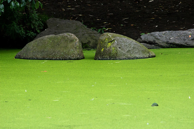
Some little bugs that walk on the water (surface tension), like water striders only smaller - I think. The water itself is pretty green but at this angle we are getting the green amplified in some areas by reflections of the trees along the pond with other areas reflecting the nice clear blue sky today.

Saturday, August 3, 2013

Base of Tower


GWB, on the New Jersey side. The New York tower is not planted in water.

Slow week, in a blogging sense, but I've been shooting some film for reasons I will go into in another post. And practicing some lighting techniques from the Strobist - again for reasons I will discuss in a separate post.